Bulimia Free — a rebrand with a point of view.
The
overview.
Bulimia Free helps women move through eating disorder recovery. The mission was strong, but the brand it wore was soft, dreamy and interchangeable with every other wellness site — gentle scripts, sunsets and gradients that asked to be liked rather than believed.
This was a complete rebrand: strategy, identity, photography direction and website, rebuilt as one confident system that respects the audience enough to tell the truth plainly.
One brand. One voice. Bold enough to be trusted.

The previous identity leaned on gold cursive, dreamcatchers and hazy sunset imagery. Beautiful in isolation, but it blurred into the sea of soft platitudes and undersold the depth of the work.
It spoke to the audience, not with them.
The
challenge.
How do you make recovery feel powerful without dressing it up or softening it? The audience is done with gentle reassurance — they want to be trusted with the truth and respected enough to be spoken to like adults.
The brand had to hold two things at once: the complexity of healing, and the beauty of it. It needed to feel both luxurious and liberating, honest and elegant.
Three directions.
We explored three distinct territories before committing — each a different answer to the same question.
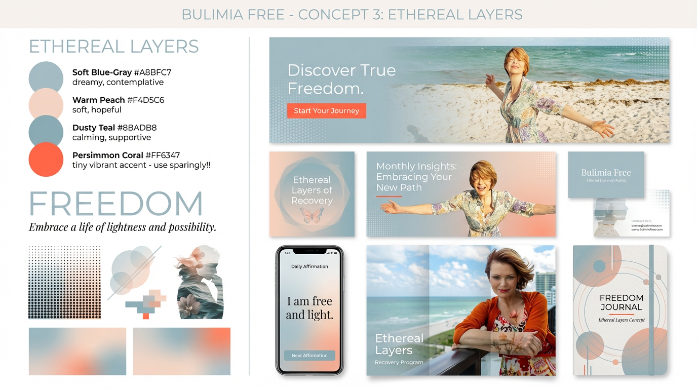
Ethereal Layers
Soft blue-gray and peach, dreamy blur and light. Calming — but too close to the category norm.
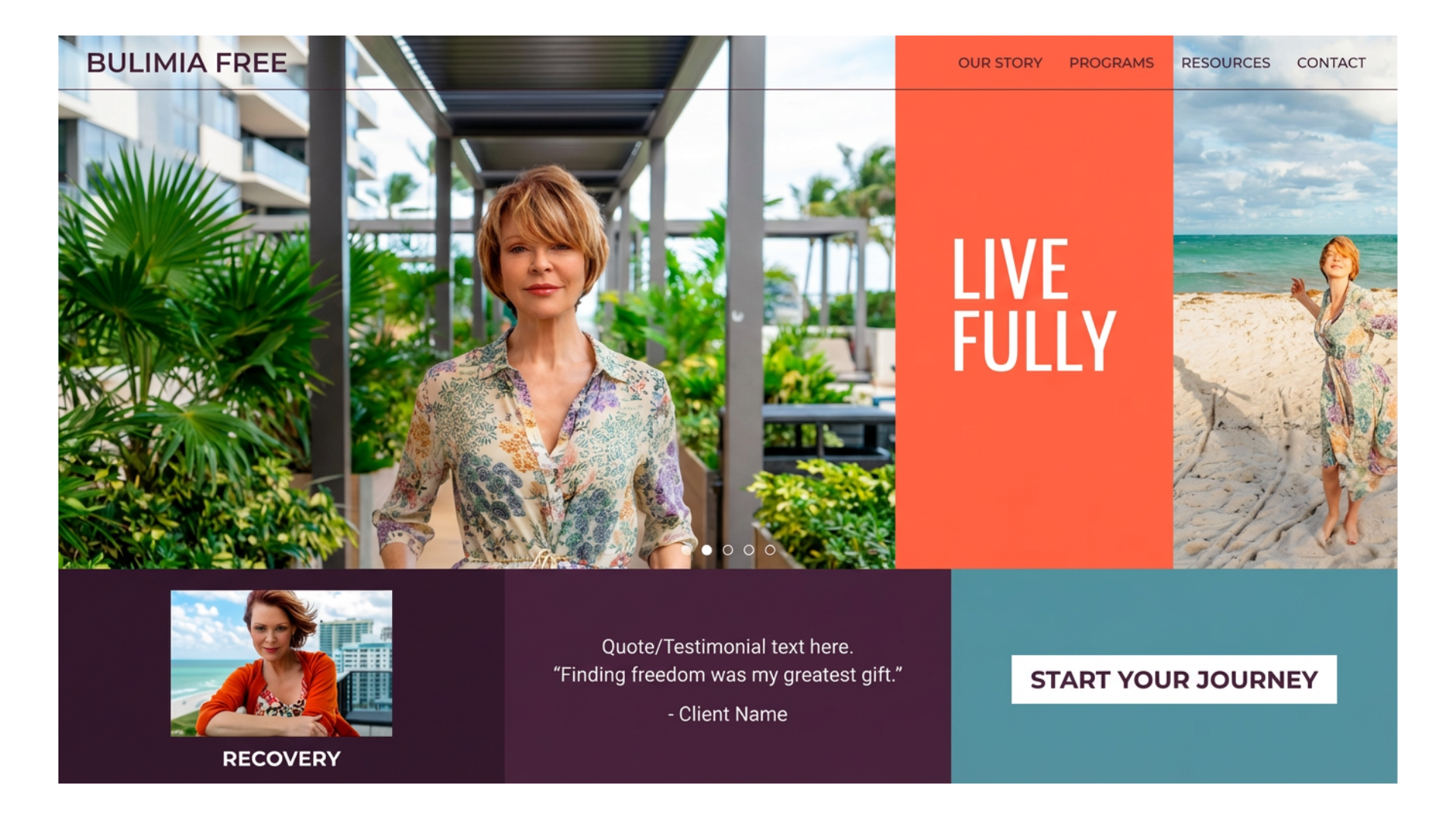
Empowered Elegance
Warmer, editorial and refined. Strong, but it leaned decorative where we wanted directness.
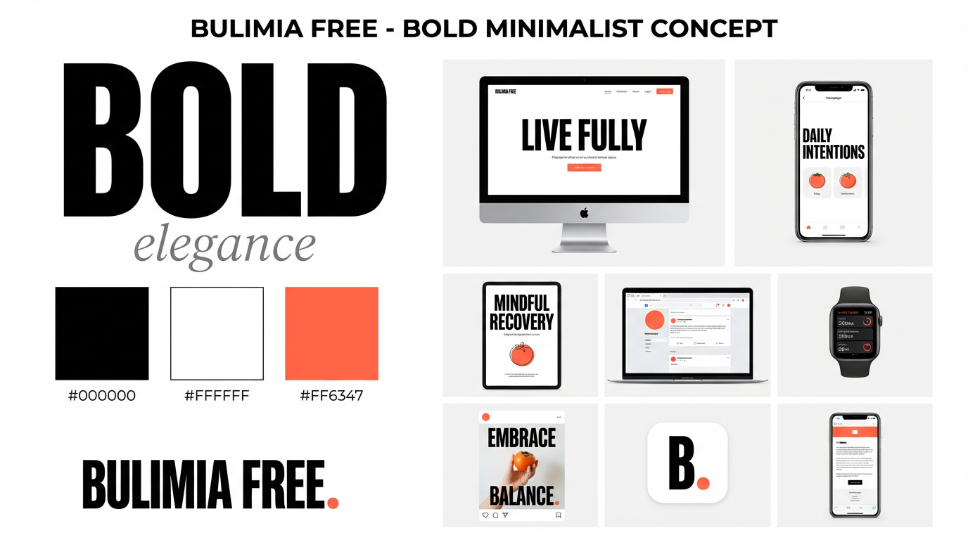
Bold Minimalism
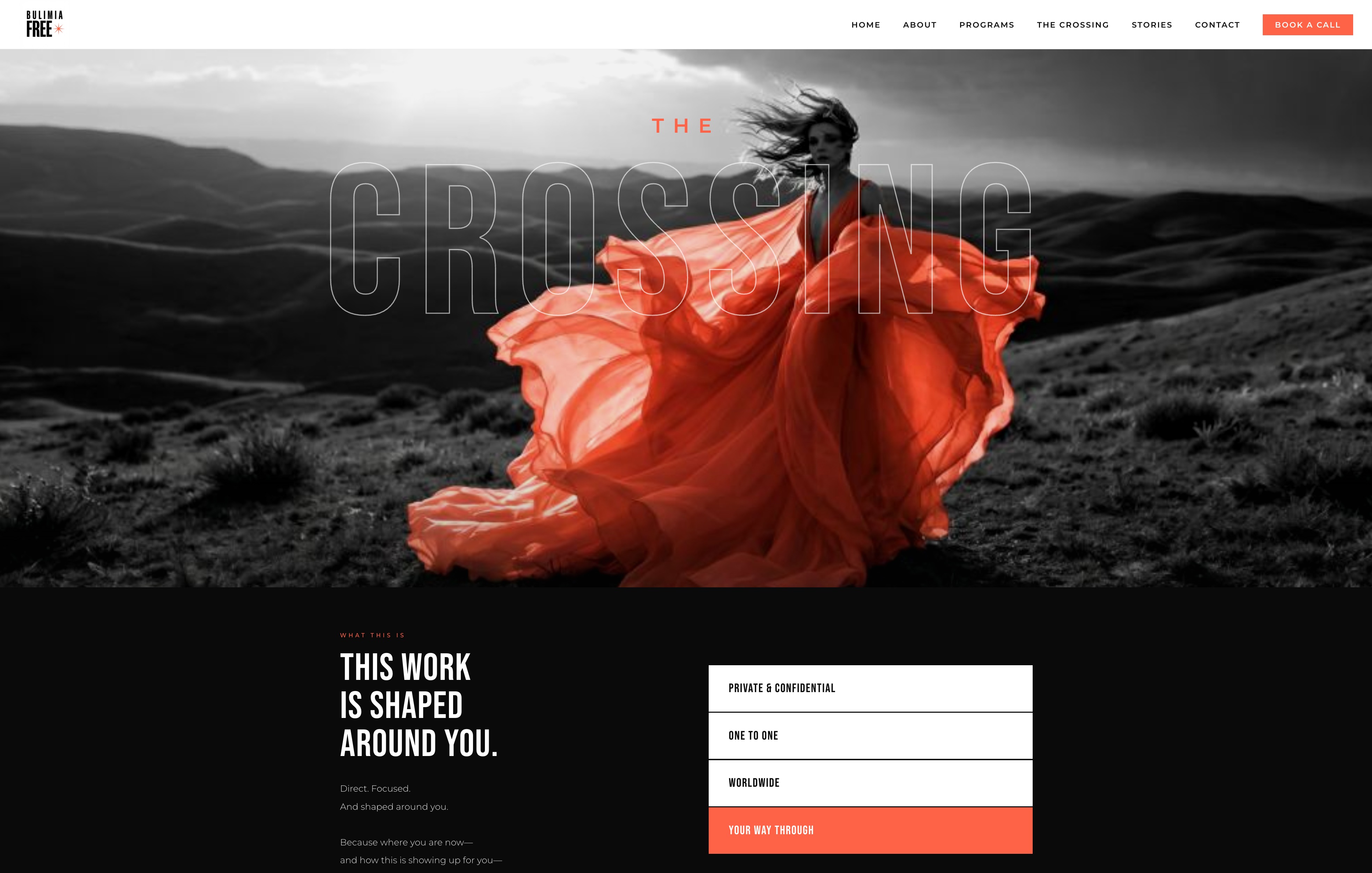
Black, white and surgical persimmon. Radical simplicity, fearless negative space. The winner.
Pretty is not the strategy.
Bold Minimalism strips everything down to what matters — the voice, the story, the freedom. Maximum impact through radical simplicity, with persimmon accents that land like exclamation points of possibility.
The
identity.
An ultra-bold wordmark that commands attention, anchored by a single persimmon starburst — a small spark of possibility against uncompromising black and white.
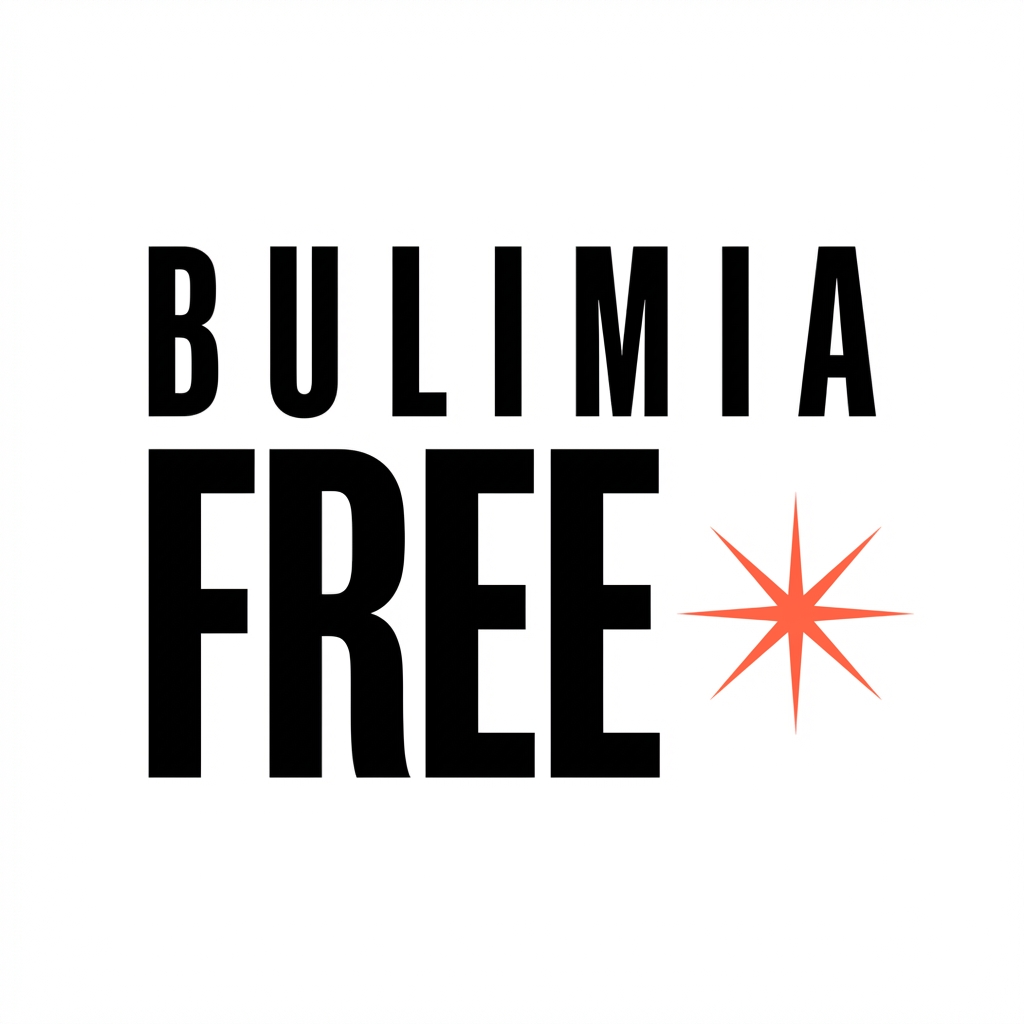
The system.
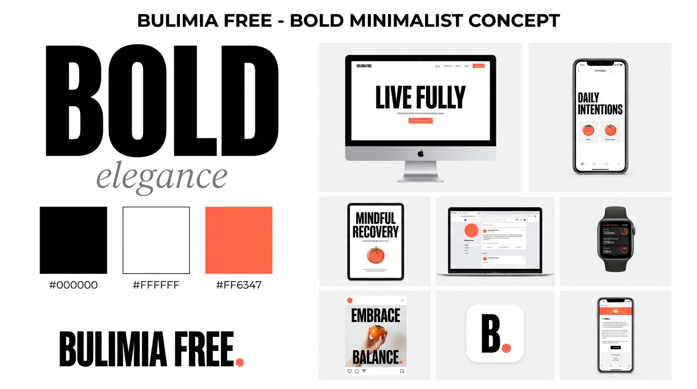
Across every surface.
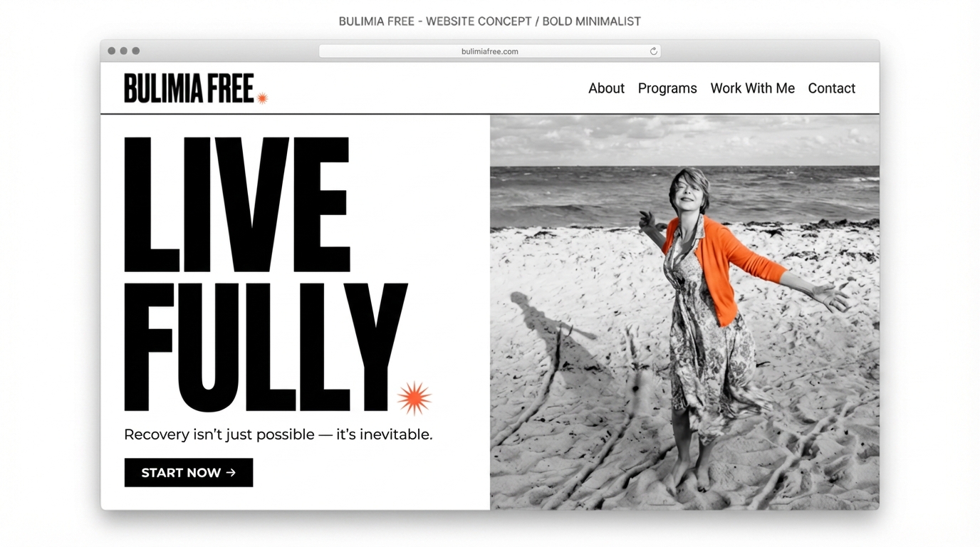
Before & after.
Same mission, rebuilt from the ground up. The soft, gold, sunset-lit brand became a bold black-and-white system with a single persimmon spark — page for page.
Hover a frame to scroll the full page.
The homepage
Website · HomeGold script, stock smiles and sunset gradients gave way to a stark editorial hero — Truth + Clarity = Freedom.
Recovery stories
Website · Recovery storiesPastel story cards became a dark, cinematic wall of silhouettes and pull-quotes that let each voice carry.
The lead magnet
Lead magnet · Free guideThe gold “Unlock Your Path-Way” block was rebuilt as a bold, magazine-style guide cover with real photographic presence.
What we
delivered.
- 01
Brand strategy & positioning
The voice, values and point of view the whole system is built on.
- 02
Logo & visual identity
Wordmark, starburst, type system and the persimmon accent rule.
- 03
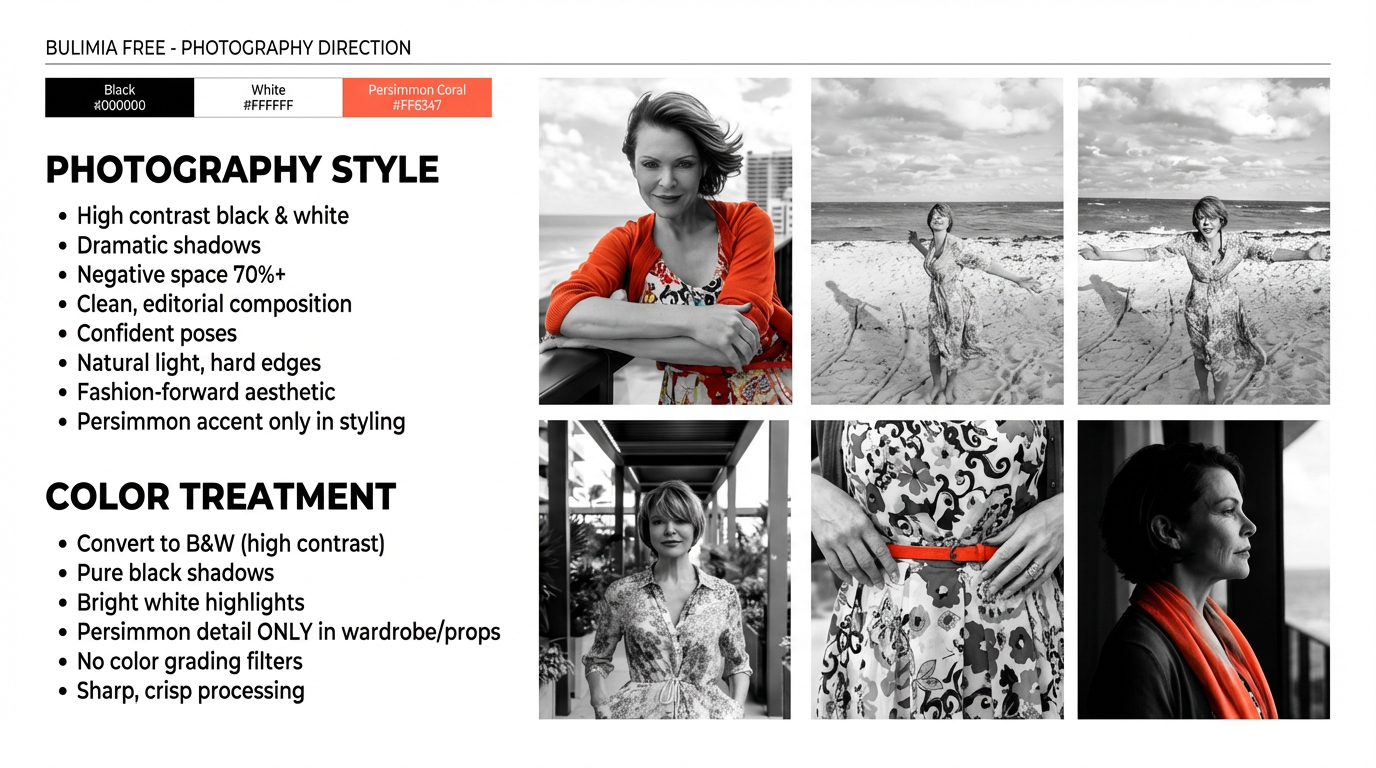
Photography direction
High-contrast B&W, 70%+ negative space, persimmon only in styling.
- 04
Website design
An editorial, fashion-forward site that trusts the reader.
- 05
Social & print system
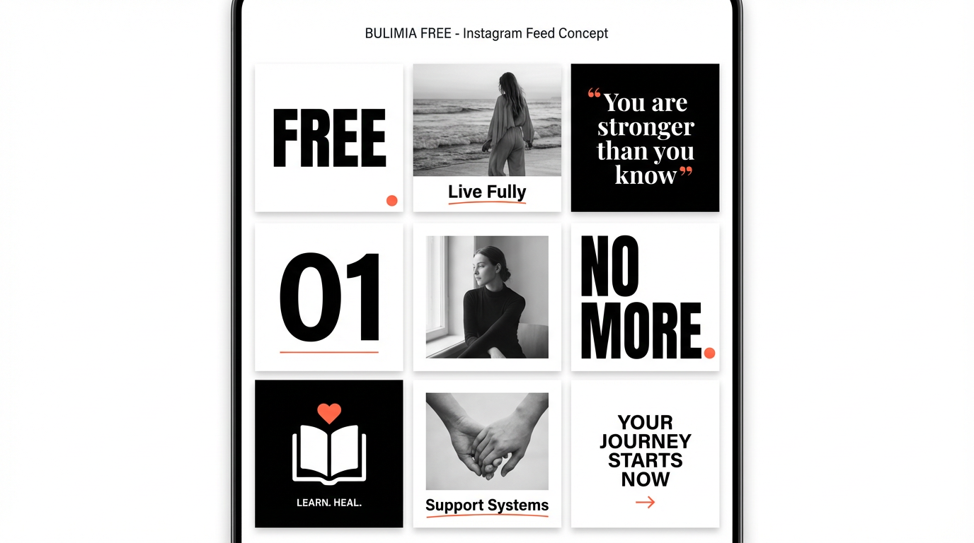
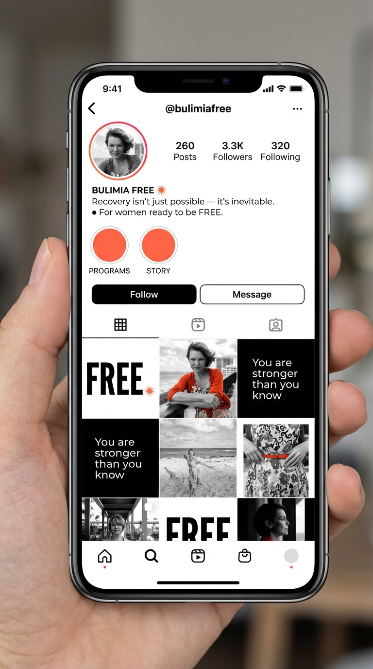
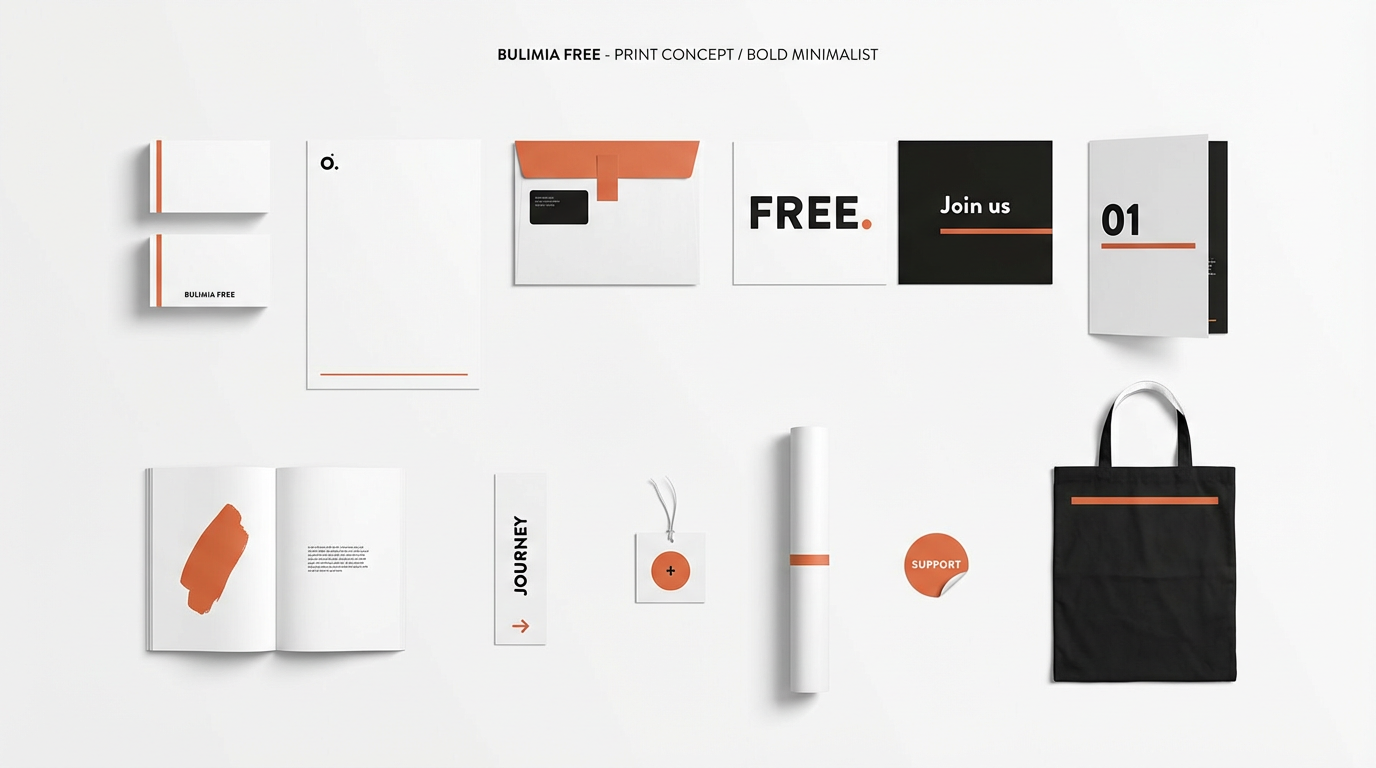
Instagram templates, stationery and collateral that all match.
The result.
Three directions explored, one decisive system chosen
A brand that stands out in a soft, samey category
One voice across web, social, print and photography
The rebrand proves that healing can look bold, feel strong and still be deeply beautiful — a visual language that respects the audience enough to be honest, and elegant enough to be unforgettable.
American Steakhouse
A 1978 institution, elevated for its first retail launch.
View Case Study