ConnectR — be the person who always follows up.
The
overview.
ConnectR is a relationship-first networking app for the people whose livelihood depends on who they know — salespeople, founders, creators and anyone who meets new people all the time and can never quite keep up.
The brief was the whole front of the business: a brand from scratch, the product's interface, and the launch presence to put it in front of early users — all before a single line of marketing copy existed.
A complete identity, the iOS app's UI design system, a story-driven launch site and a TestFlight beta funnel — one electric-green world, from app icon to early-access signup.
The
challenge.
Nobody wakes up wanting “a better contacts app.” The real problem is emotional — the quiet guilt of the follow-up that never happened, the name you forgot, the opportunity that slipped away.
So the work couldn't just look good. It had to name a feeling people recognise instantly, then make the fix feel effortless — across a brand, a product and a launch, all consistent enough to feel like a company that already exists.
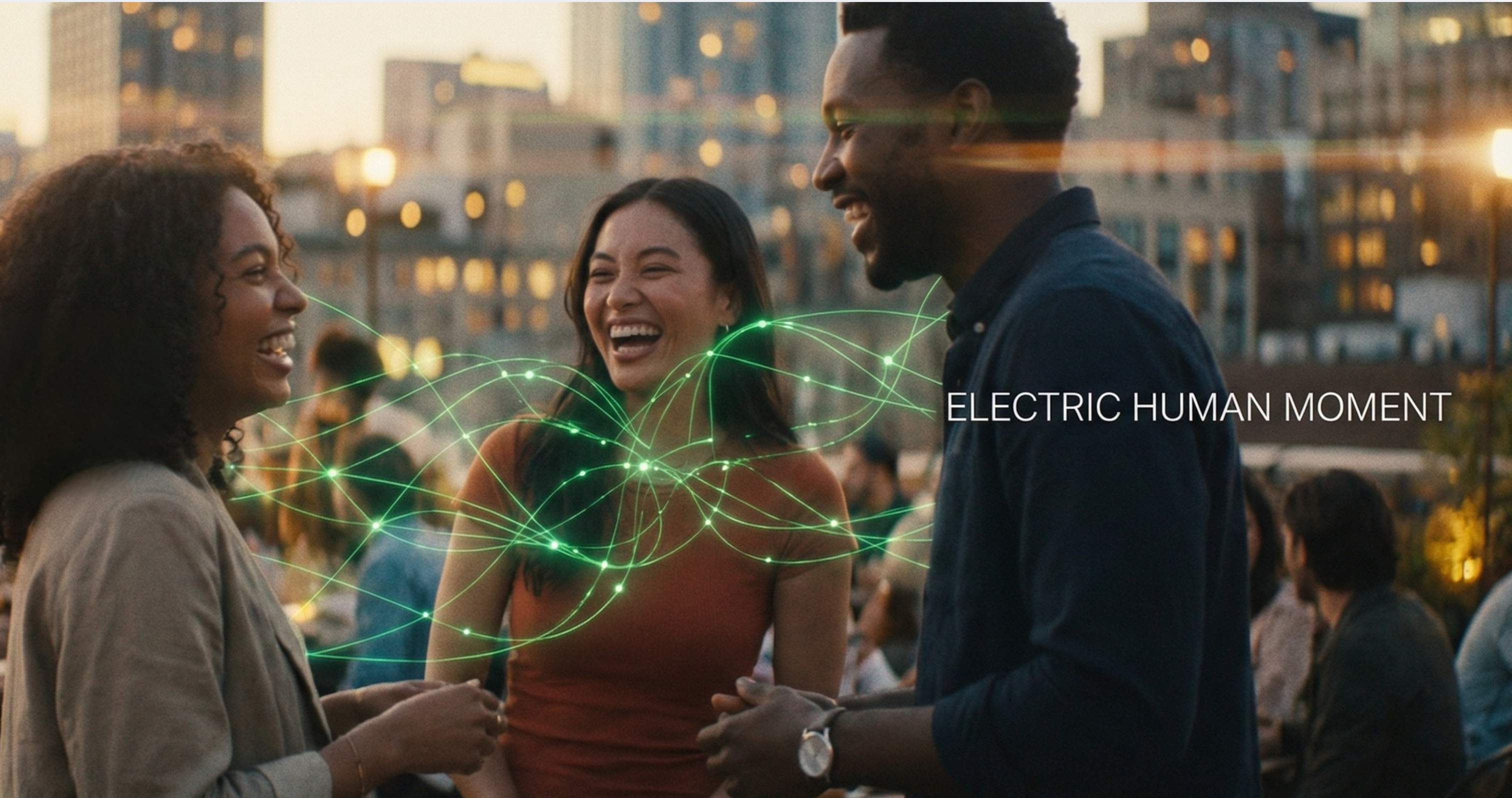
The spark is human. The follow-up is the app.
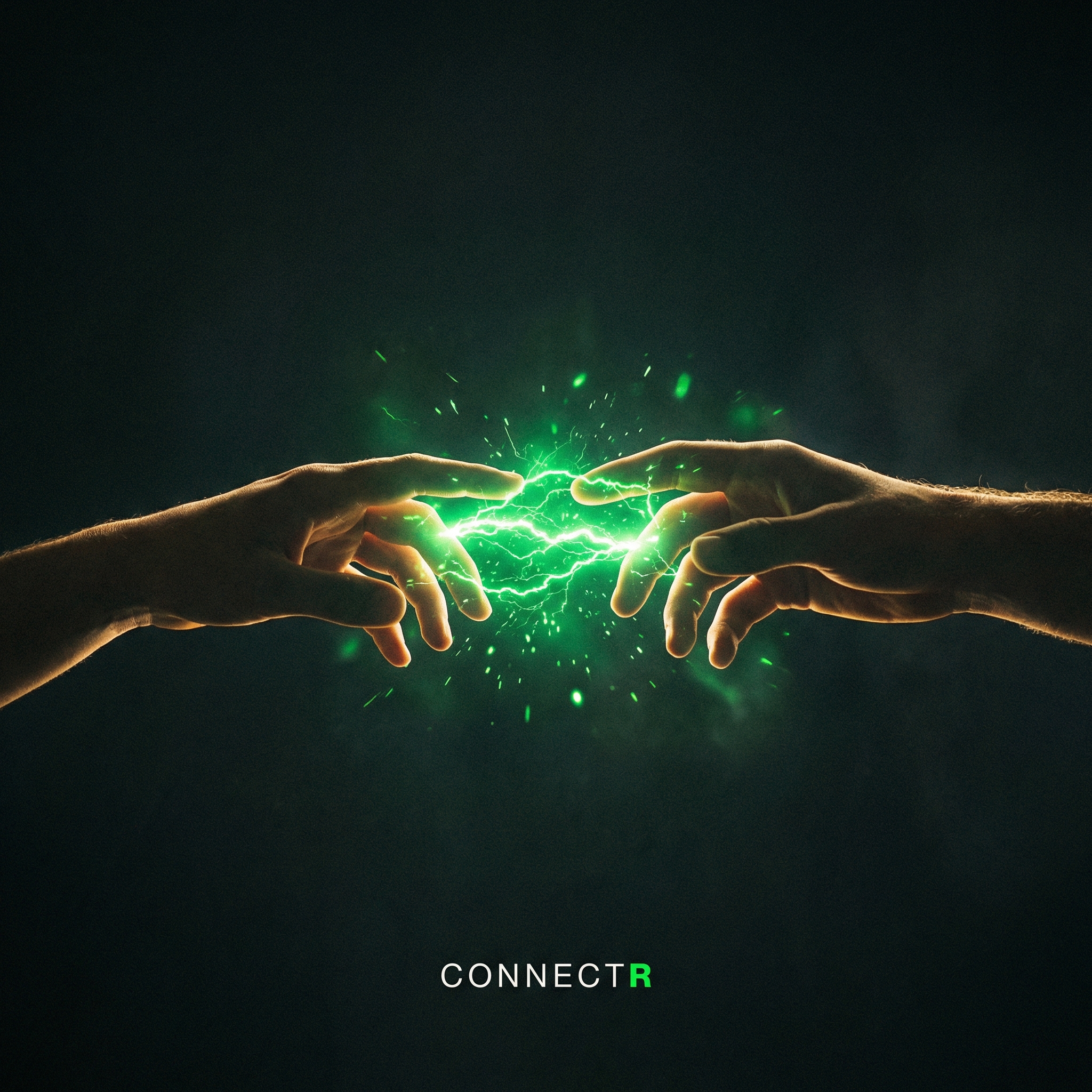
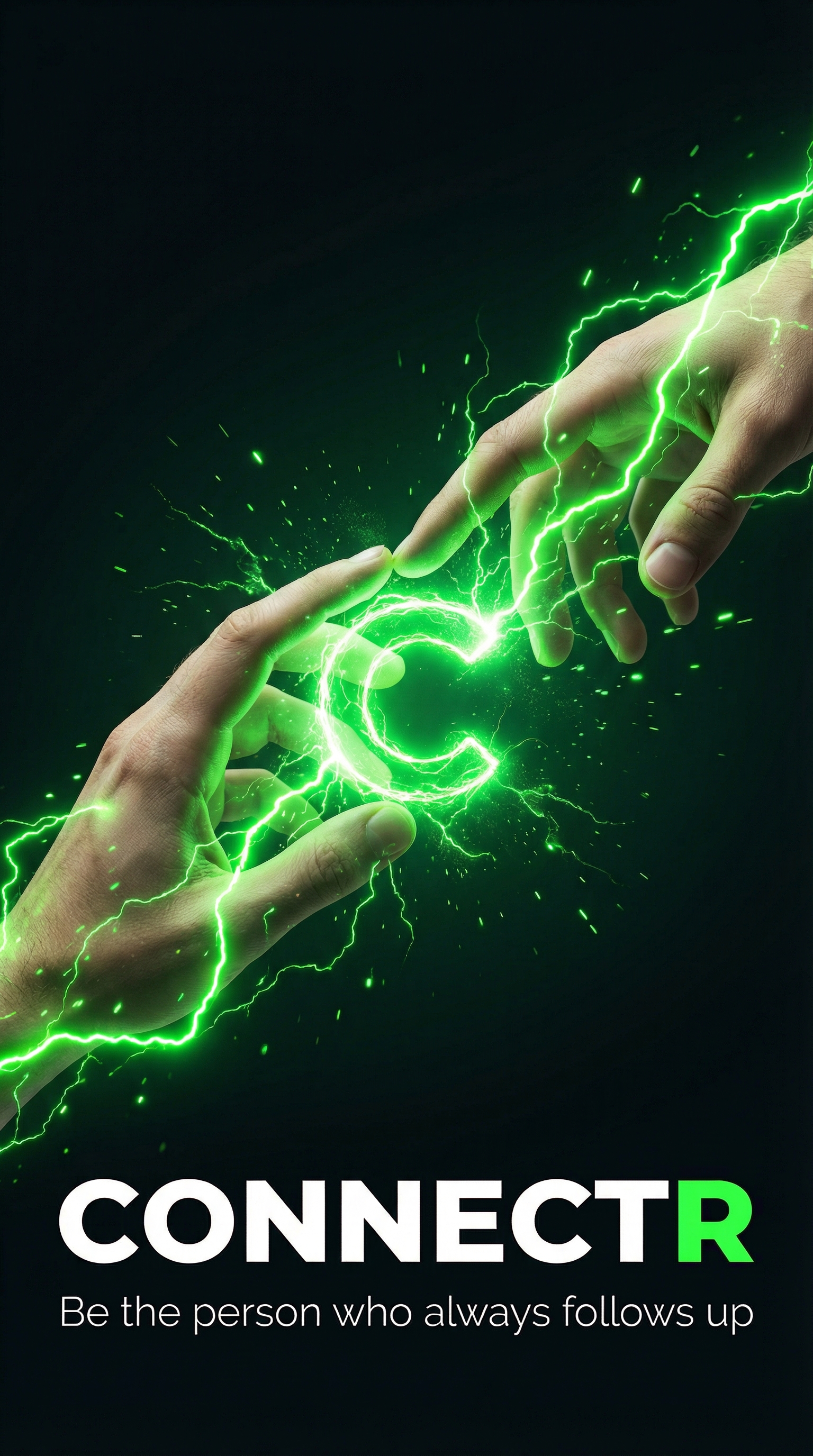
Every asset leads with a real moment between people — then a charge of electric green marks where ConnectR steps in. The brand sells the relationship; the product just makes sure it survives the next morning.
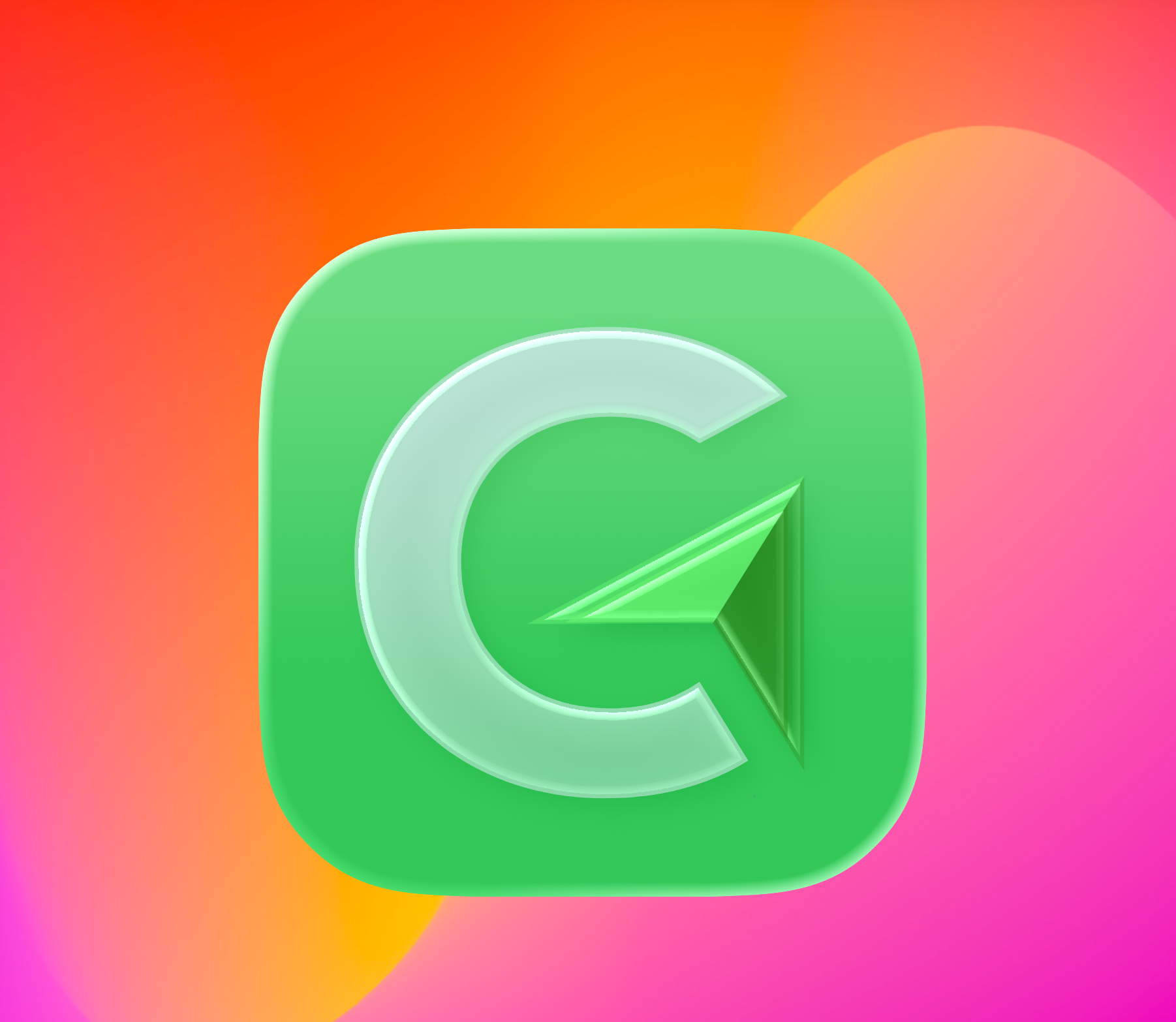
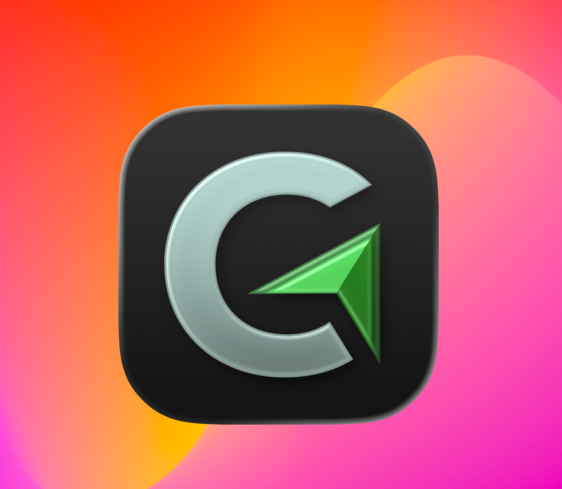
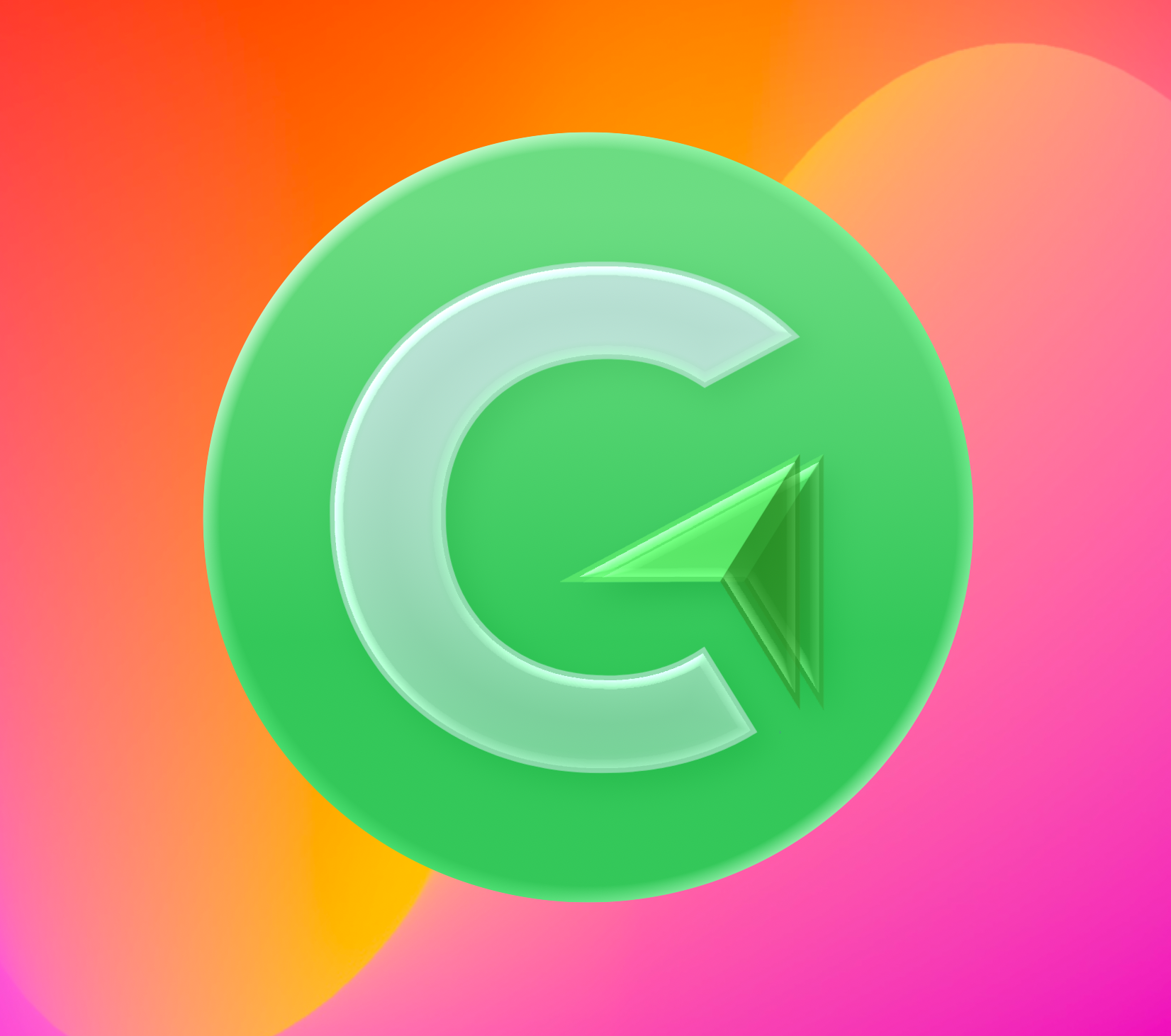
One mark, charged up.
The identity fuses a “C” with a forward-pointing send arrow — connection plus follow-through. I explored it across finishes so it holds up as an app icon, a favicon and a glowing hero alike.

A dark
product palette.
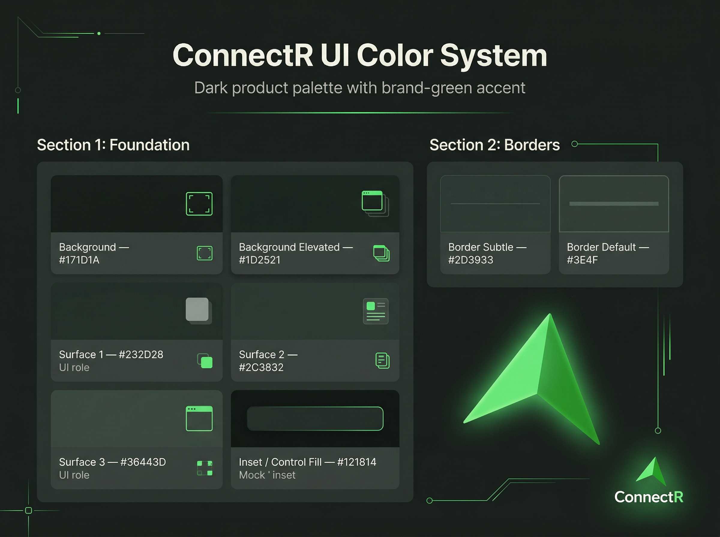
The app lives in the dark — layered near-black surfaces so a single brand-green accent can carry every action, state and highlight. I defined the whole token set so the interface stays legible and consistent as the product grows.
Contacts, with context.
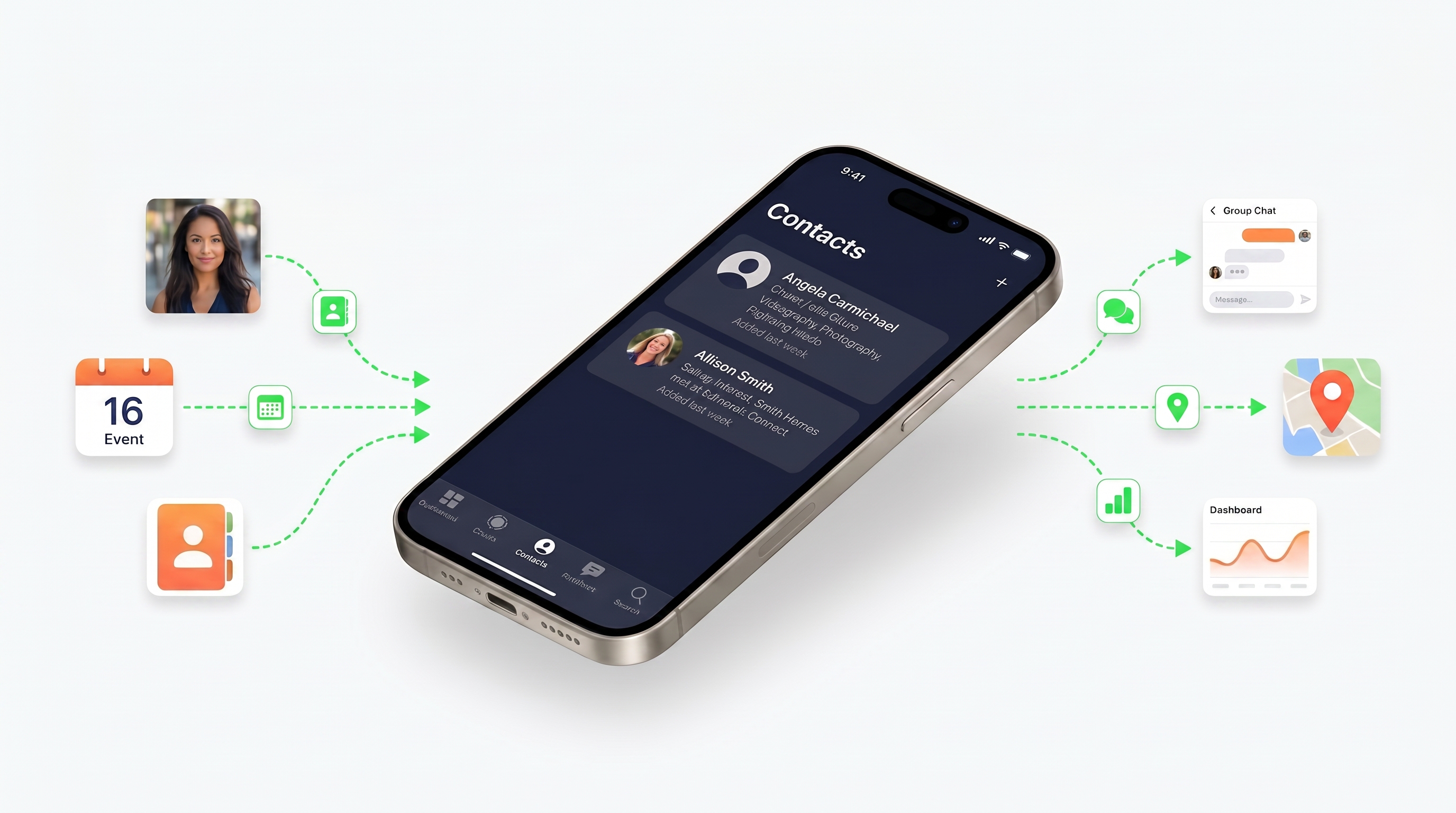
The app is built around one idea: you don't remember people alphabetically. Every screen captures where you met, what you talked about and what happens next — then plugs into calendar, messages, maps and a dashboard so following up is a tap, not a chore.
A launch, in two moves.
A marketing site to sell the idea, and a TestFlight page to convert curiosity into beta testers. Both are live — hover to scroll the full page, or click through to see them in the wild.
Marketing site
The public launch site — the emotional hook, how the app works, and who it's for. Built to make a brand-new networking habit feel obvious.
TestFlight page
A focused, dark-themed conversion page — proof stats, a clear early-access offer, and a single job: get the right people into the beta.
The electric human moment.
A campaign system where real connection is made visible — a charge of green passing between people. One look that scales from a story-format ad to an app-store hero.

What was delivered.
The whole front of the business — brand, product interface and go-to-market — designed as one connected system.
- 01
Brand identity
Name treatment, the C-arrow mark, app-icon system and the electric-green visual language.
- 02
Product UI design
The iOS app's dark interface — contacts, context, follow-up flows — and its UI color system.
- 03
Launch site
A story-driven marketing site that turns a novel idea into a habit people want.
- 04
Beta funnel
A TestFlight early-access page engineered to recruit high-signal beta testers.
- 05
Campaign assets
Cinematic 'electric human moment' imagery for social, ads and the app store.
Fior d'Abruzzo
Premium Italian olive oil — from grove to Shopify.
View Case Study